Wednesday, October 31, 2007
textile arts
Thursday, October 25, 2007
a change of scenery

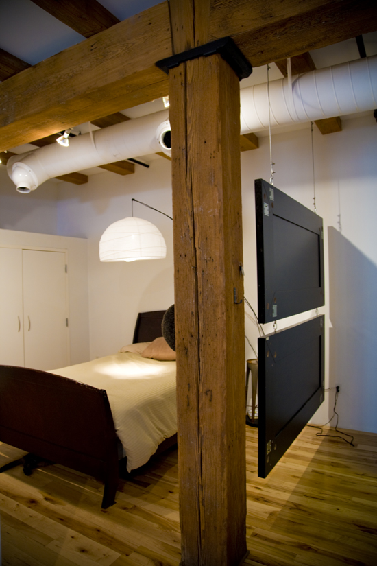
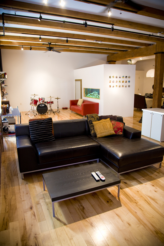
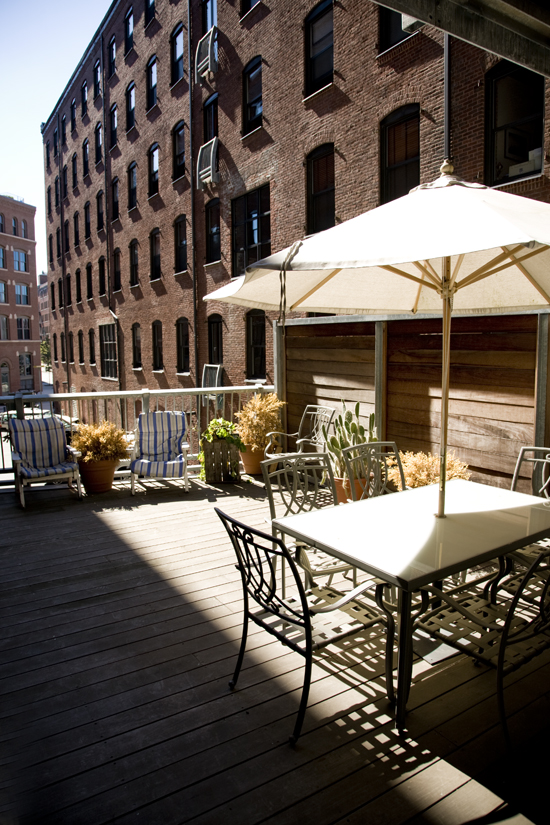
I'm moving!!! In solidarity with the line sung by Ms. Crow, "A change, a change will do you good...", I'm relocating myself! Not beyond Ottawa's borders (for now), but beyond the (lovely) brick walls I've lived in for the last year. I love change. I need change. I go batty if I stay in the same place for more than a year at a time, so...I'm moving into a new (and uber cool) living space. The move is still a month and a half away so photos are pending, but I'll leave you with these descriptors which will give you an imaginative sneak peak into my soon-to-be home:
converted armoury. loft. exposed brick walls. rooftop patio. my own washer and dryer.
*sigh*
I'm so excited!
converted armoury. loft. exposed brick walls. rooftop patio. my own washer and dryer.
*sigh*
I'm so excited!
Friday, October 19, 2007
en route

I've been on and off airplanes lately like most people go in and out of coffee shops. Lucky for me, Air Canada's en route magazine has been good at keeping me distracted from thinking about my rapidly growing ecological footprint (ugh).
The airline magazine is really impressive - good design, good interviews and stories, intriging hotel and restaurant recommendations - it really seems to have its finger on the pulse of current design trends. If, unlike me (consider yourself lucky), you aren't hopping on and off Air Canada flights fast enough to read every edition in print, you can still check it all out on their online e-zine linked above.
In addition to all the eye candy it holds this month, it also has this article which I could really relate to (and I imagine a lot of you will be able to as well).
* Image above from the magazine's recent design competition.
Tuesday, October 16, 2007
Heineken WOBO

How cool is this?! Featured on Inhabitat and blogged at Apartment Therapy, these Hieneken beer bottles were designed to turn waste into something useful.
Mr. Heineken’s idea came after a visit to the Caribbean where he saw two problems: beaches littered with bottles and a lack of affordable building materials. The WOBO became his vision to solve both the recycling and housing challenges that he had witnessed on the islands.


This concept was later termed upcycling by William McDonough and Michael Braungart's book Cradle to Cradle. (I actually came across this book in Alaska a couple years ago and bought and read it. It's really intriguing - I highly recommend reading it if you're interested in sustainable design).
Wednesday, October 10, 2007
this ain't no disco

Okay. I just came across a very cool inventory of interior images and not just any interiors - the interiors of design agencies. Check out This Ain't No Disco and then check out their flickr stream.
the apartment

Came across The Apartment today while flipping through an old design magazine. The Apartment is a design, architecture, branding and creative firm based in NYC. I've only just started looking at their website and am totally intrigued...there are interiors, interviews, shopping and restaurant guides, and more - all presented really well. Check it out.
Tuesday, October 9, 2007
my first visit to washington, dc

I'm going to Washington, DC this week for work (which includes attending a dinner that this man is speaking at), and, more importantly, getting in a visit with my dear friend Annie (yes, Annie trumps Ki Moon). Because of my work schedule, our only free time will be in the evenings which probably means limited store-hopping BUT I was still stoked to see d*s' decor store guide to DC on her blog today. Talk about perfect timing!
Monday, October 8, 2007
umsteigen

I bought this hoodie (above) today which led me to http://www.iloveumsteigen.com/ which led me to a whole collection of fun wardrobe pieces...


Sunday, October 7, 2007
dining room inspiration
 I found this great image on coco+kelley's blog this morning and had to document it to go back to later for decorating ideas. I really like the look of this room: the plum walls, the curtains, the stools around the table, the lamp, the raw wood floor. It looks really inviting to me - chic and laid-back at the same time, with an emphasis on a sense of the organic (at least I think so) - the flooring as well as the woven(?) stools...
I also really like the look produced by leaving the walls beneath the windows white instead of painting everything but the window frames plum. It lengthens the look of the windows - at first glance it looks like the windows could be floor-to-ceiling in length - and it really brightens up the room.
The plum paint does seem to stop short of the ceiling in an 'unfinished' look. I'm not sure if that was on purpose or if the room really was unfinished when this shot was taken, but regardless, this 'look' is going in my database of design ideas to potentially attempt to recreate at some point...
Friday, October 5, 2007
craigslist

I'm a craigslist junkie. It's true. I'm always scanning apartments and furniture (and occassionally the pet section if I feel like I need a cute, cuddly visual pick-me-up). I'm such a craiglist junkie that I don't even confine myself to my own city. I check stuff out everywhere and every once in a while I actually come across apartment photos that showcase good decorating (most of them are horrifying or just plain boring). I came across these images from a 2 bedroom apartment for rent in Toronto this morning and wanted to document them. The space itself is great, but the way it's been decorated makes it really stand out. I love the cluster of framed photographs/ prints in the image above and the wooden wardrobes(?) in the photo below are also pretty intriguing (not to mention the wooden wall separating the kitchen from the living room).


Thursday, October 4, 2007
vtwonen

I'm so glad decor8 linked to vtwonen's online magazine. I can't understand a thing on it because it's all in dutch (?), but I can certainly understand the visual images and they are YUMMY. Mmmmm...mmmm...mmm... Make sure you check out their paint colour page - it allows you to click on the paint chip you're interested in and shows you an interior using that colour - visual FEAST!


Wednesday, October 3, 2007
design*sponge and 'home'
Life is a blessed thing.
great colour and design
 My favorite entry so far in Apartment Therapy's I've Got Colour! contest is Heather's home in Austin, Texas. I love her use of colour and her decorating scheme. Some of the other entries use great colour, but the overall feel of the home isn't as well pulled together as this one (in my opinion). I especially love the dining room (pictured above). That colour and those photos on the wall are intriguing and look really great. Check out the other entries here.

Monday, October 1, 2007
zoe pawlak
Subscribe to:
Comments (Atom)


