Friday, August 31, 2007
furni time tickers
hello LOHA

Lorcan O'Herlihy Architects (LOHA) is an architecture and design firm based in California. Their work is stunning (and their website is pretty nifty too!). I've only checked out their residential designs so far and had a hard time choosing a favorite, but the exterior (above) and view! (below) of the Lexton MacCarthy Residence (click the Lm on their 'periodic table of elements' on their website) really caught my eye.
 Also of note: I'm not one for subdivisions, but their 12 Houses plan (click Hv) gives cookie-cutter urban sprawl eyesores reason to hope.
keeping up with the jones'
 Hilarious. I got a good laugh out of this silly (or creepy?) pair of lemon and lime juicers. The Mr. and Mrs. Jones Juicers were crafted up by Polly George and can be found this side of the Atlantic at unica HOME. Juicing just got a lot more intimate.
Thursday, August 30, 2007
if you can't beat 'em, join 'em
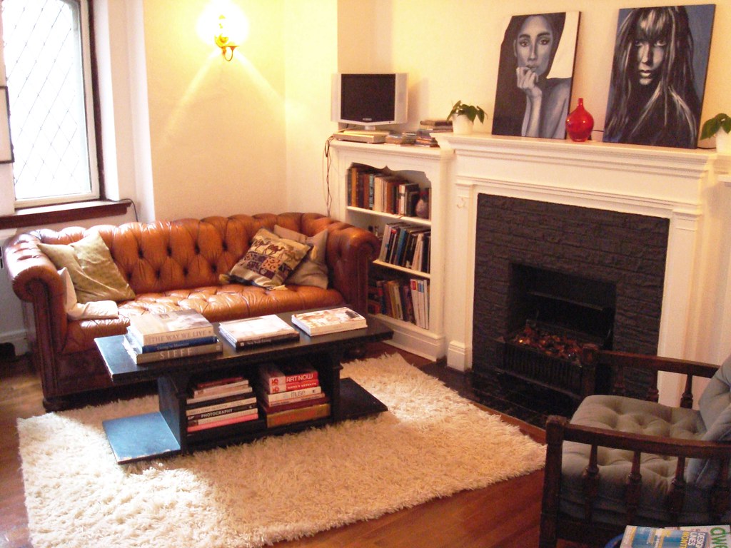 I'm resigning myself to an early fall. It's cold. I'm wearing jeans. Pretty soon I'll be forced to carry a sweater with me. I've decided that I have to embrace it (survival tactic) or else I'll mope for a whole month (and no one likes a moper). So I'm starting to dream about pumpkin lattes and woolly sweaters and getting cozy. What better way to start than by reorganizing my living room (okay, so what if it's a bi-monthly activity)? Last night I created a definite split between my 'dining area' (not shown) and my 'living area' (pictured above). I'm happy with it. And now I have a very inviting, corner reading nook with a coffee table for easily-reachable book access and coffee mug placement. I hung out there for 4 hours last night and felt very satisfied. That's a good sign.
Wednesday, August 22, 2007
a year of mornings


 I absolutely love this concept. Two friends, 3191 miles apart, take a photo every morning and post them side by side on their website. A visual storyline of relationships, everyday experiences, and chance compositions that go way deeper than surface beauty (although there's no shortage of that!). Check it out.
Tuesday, August 21, 2007
tidbits from toronto

I spent the weekend visiting an exceptional friend in Toronto who gave me a personal tour of some of the city's hotspot design and decorating stores (and restaurants and clothing boutiques and and and...). To be honest, I didn't mentally document everything as much as I thought I would because I was enjoying the moment too much to plan ahead for future blogging posts. HOWEVER, a few spots did stand out...
I had no difficultly understanding why Commute Home received so many raves. The store's handmade, on-location-crafted furniture pieces are gorgeous, unique and that perfect blend of modern-meets-antique. I already want to go back and take a second look.
The other stand-out stop was Ministry of the Interior, a design store/ gallery space that happened to be featuring some of Jason Miller's work (including the daydream mirror above), which for me was a chance of perfect-timing as I'd just read Dwell's article on him a few days earlier (only available in hardcopy). I love it when that happens - you read about an artist and their work and then get to put it into focus by unexpectedly coming across it in person soon after. Uber cool.
One thing's for sure, my tidbit taste of Toronto left me with an appetite for more and cast Ottawa's limited design scene into even paler light. Good thing the distance from here to there isn't as wide as the gulf between reality and dreams in Miller's conceptual art meets contemporary design objects...
Wednesday, August 15, 2007
spanish eats in new digs
 Spanish artist/ designer Jaime Hayon has designed a new restaurant for a prestigious Spanish chef that will be opening this september, according to Frame magazine (see link for more photos). Looks like it's worth adding to the travel journal list!
Monday, August 13, 2007

You may have outgrown youth hostels and lonelyplanet guides but most of you have not outgrown traveling. For those of you who are lucky enough not to be chained to a mortgage, 2 children and a minivan there is a new guide to the planet. Brought to you from the ever stylish people at Wallpaper magazine are Wallpaper City guides (40 cities profiled). Each guide profiles an eclectic mix of restaurants, shopping, hotels and design stores. Most venues are known only to locals and since the authors have inserted a discreet map on the last page you might even be mistaken for one.
definitely darling
 These pendants at shine everyday are gorgeous and versatile. They'd fit right in with ornate interiors as well as add a touch of feminitity to masculine minimal interiors. It's all in the details and these details are all good... I'm not sure how the light inside them is set up, but they'd look great as outdoor tabletop lanterns for late summer/ early fall backyard dinners as well.
Sunday, August 12, 2007
coolest sister ever
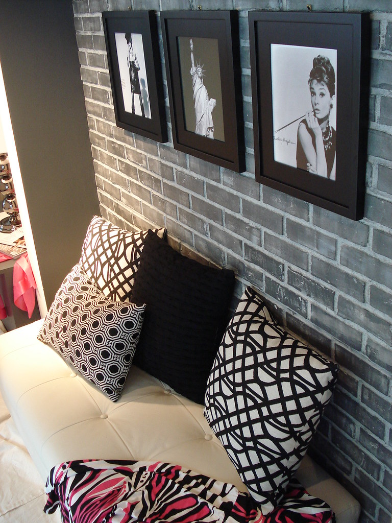
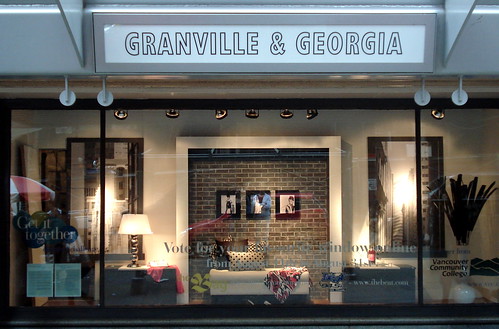 Update regarding the sibling rivalry post below...The Bay got the website details all wrong and paired the wrong designer with the wrong design with the wrong city (wow), so the website for viewing and voting isn't up yet. Should be up soon. Check out www.thebay.com/windows this week. My sister's totally awesome window display design is above. Cast your vote for the design you think should win! My sister (the cutie-patutie below) is the coolest...Love you! Good luck!

Friday, August 10, 2007
fish bowl bookends
 My friend Annie sent me the link to these ADORABLE fish bowl bookends today. I love them! Too bad my cats would go to town on them, otherwise I'd snatch them up for sure. Super fun - thanks Annie!
sibling rivalry
 *disclaimer: my sister and I have never actually been design rivals. She blows me out of the water without even trying so I've never even bothered to compete with her...
My incredibly talented sister, Stephanie, is one of 3 interior design students handpicked in Vancouver to compete in a national design competition with the Hudsons Bay Company. She was given a client portfolio a week in advance of the competition, drafted a design idea, had it approved by the judges and is currently (today's the last day) spending her 9-5 hours this week inside a window of the Bay department store in downtown Vancouver creating a space to suit her 'client'. Two other students are doing it at the same time. Each has been given their own window space, some money to cover hardware and paint from external sources as well as some money to spend inside the Bay. This whole week, passersby have been able to watch her at work from the street. Beginning tomorrow, her design will be judged by a panel of interior designers. The winner will receive $500 to spend at the Bay and, more importantly, fantastic exposure. She's only in her first year of design school but is already at the top of her class and is clearly on her way to greatness (proud older sister speaking here :). The same competition is currently taking place in Toronto and Montreal.
Beginning tomorrow, you'll be able to view all of the designers with their designs online at www.thebay/windows (webpage available as of Aug.11) and vote for your favorite.
Go Stephy Go! She's amazing. I love her. And one day when she owns her own design company, I'm going to work for her...right Steph?
PS - you can check our her own photos of her project as it comes along at her flickr site.
Tuesday, August 7, 2007
organizers extraordinaire
 The photo above is the most calming image I saw of Im and David Schafer's studio living space in San Diego. I got a kick out of this article that describes their creative solutions to attaining organized pack-rat status in a 426 square foot space (although it would be hard not to look like a pack rat in a space that small for two people). Very enjoyable read and, for me, a good opportunity for mental notes (I'm considering downsizing to a smaller *read: more budget-friendly* apartment). Always fun seeing people get creative with challenging spaces like these two do. Makes you realize that any space can be transformed into a great living space. Where there's a will, there's a way!

Thursday, August 2, 2007
new designers online
 newdesignersonline.co.uk is a great resource for information on - get this - new designers. So if you want to keep your finger on the pulse of the new and upcoming design world, keep an eye on this site. In the meantime, a few tasters from the site below, as well as House Couturier's gorgeous wallpaper above.
The Miss D. phone booth from Janelle Ramsay. Love it - very fun.
 Richard Stump's Bench for Sustrans...
 And Gary Smith's stash sofa...('stash' because you can stash stuff inside of it - the top cushion lifts up).
chris deam on dwell

For a closer look at the designer and design of the airstream trailer below, check out this video interview on dwell. So great. I want one (I say that a lot...). Thanks again M!
PS - maybe if we'd been driving one of Chris Deam's airstreams yesterday, I'd be in Quebec City today like I was supposed to. Instead, our car broke down and we're all still in Ottawa...on the bright side, I think I may use to the (now freed-up) weekend to explore antiques and flea markets, thanks to hot tips from Ottawa-blogger Kim over at desiretoinspire.
Wednesday, August 1, 2007
DWR airstream trailer
 Thanks to M for sending me the link to this super cool airstream trailer. Perfect timing, because tonight I'm off on a 5 day roadtrip to Canada's Atlantic Maritime provinces. Unfortunately, we won't be travelling in this much style, but it sure looks like a sweet way to camp. Check out the interior shots below.
 I love the description of the creation of the first airstream trailer: 'An avid outdoorsman, Airstream founder Wally Byam married a woman who had little interest in the "adventure" of sleeping on the ground. When he built his bride a tent on a Ford Model T chassis that he could tow behind the car, marital bliss was restored. The project gave Byam an idea for a travel trailer that moved like a "stream of air" and in 1936, America got its first look at an Airstream'.
Architect-designer Chris Deam gutted an original trailer in 2000 (more photos on his site!) to create a more airy interior which led to the creation of the DWR airstream trailer.
And on a sidenote, the idea of gutting a trailer reminded me of this very creative outdoor cafe a friend and I came across in Berlin...
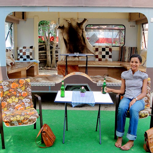 Have a great weekend everyone - be back next week!
Subscribe to:
Comments (Atom)
