Tuesday, July 31, 2007

hayon studio

"Showtime Collection for BD Ediciones de Diseno is a home furniture collection inspired on classical MGM musicals. The concepts behind these pieces explore the contrast between what is external and internal. A comination between organic forms and classical details is key to it's development. It exhibits passion for finding ways where things that are not supposed to match, coexist in elegance. Very innovative material combinations like plastic and leather were used to create this unique collection."

Hayon Studio link found via Bloesem's blog. Love the imagery! I also recommend their great bathroom pieces, Artquitect.

Monday, July 30, 2007

prefab modular cabins

Oh la la - flippin' fabulous prefab cabins at BlueSky MOD. I saw a show at the Vancouver Art Gallery last year on prefab homes and cabins and was delighted with the design ideas, arcitectural lines and details, and simple living reflected in the exhibit. Modern, clean (yet somehow still rustic) and environmentally sustainable , I left the show wanting to click my own little shoebox home together somewhere out in the wilderness (preferably) or (also appealing) on a tiny, downtown, industrial lot somewhere.

My favorite design in the exhibits were the weeHouses by Alchemy Architects. Totally adorable and totally chic. I want one. Please.

Other prefab, modular home ideas can be found at Versadome, LivingHomes, Modern Cabana, Marmol Radziner Prefab, Modern Modular, The Micro Compact Home, and GlideHouse.
Friday, July 27, 2007

my (work in progress) living room

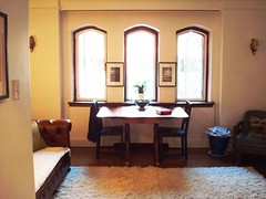
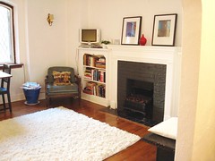
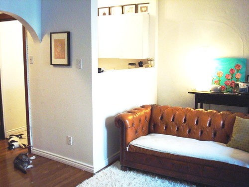
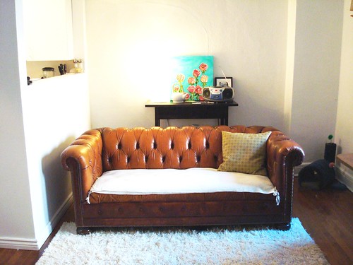
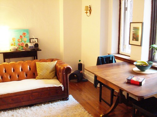
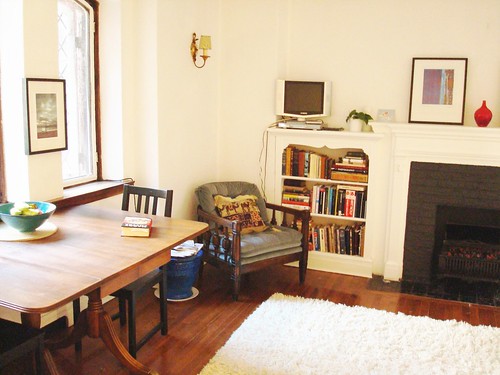
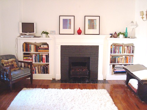
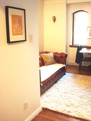
As promised in an earlier post this week, I'm showcasing some photos of my living room for furniture placement advice. (Sorry about the lousy photo quality - I always seem to have lighting problems when I'm taking photos in my apartment - clearly it feels like it's not ready for beauty shots ;). So, without further delay, here is my living room at the moment (note: I only moved into this space a month ago so forgive the lack of decorations - right now I'm prioritizing the room set-up, then I'll get stuff up on the walls...).

Views when you enter my apartment and first look (from left to right) into the living room.
Looking (left to right) towards the back wall of the living room (with the space that looks into the kitchen).
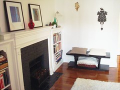
Looking (left to right) towards the fireplace (with the last shot looking towards my kitchen doorway and apartment door). PS - the black bench thing under the cuckoo clock was rescued from the basement dumpster - score!
A few things to note: I bought a second matching rug this week (in the 'as is' section at ikea - discounted and therefore justified right?) to help the shag fill the space. I plan on sewing the two together so they don't separate every time my kittens attack them. I wish I could centre the rug in front of the fireplace, but the kitchen wall that juts into the living room prohibits that. Also, I've tried the dining table against the back wall and the couch closer to the fireplace, but it really makes the room feel small - plus, I like having something centered under the windows (used to be the couch). Okay, let the advice flow...thanks!

Thursday, July 26, 2007

hotel fox

It's never very surprising to come across great, creative Scandinavian design - it's like the region's inhabitants are born with it and maximize their talents to their full potential. I love the idea of theme hotels with individualized and very forward-thinking room design, so Copenhagen's Hotel Fox's 61 rooms provide eye candy galore.

fancy and whimsy from elsita

I'm digging elsita's strange and wonderful prints (on http://www.etsy.com/). Upon first glance, they're precious, beautiful illustrations. After a closer look, you begin to notice the darker, fairytale side to them as rabbits eat insomnia-inducing holes into girls and knit wool onto sheep...yes, strange indeed. Strange and fantastic...


fruition design


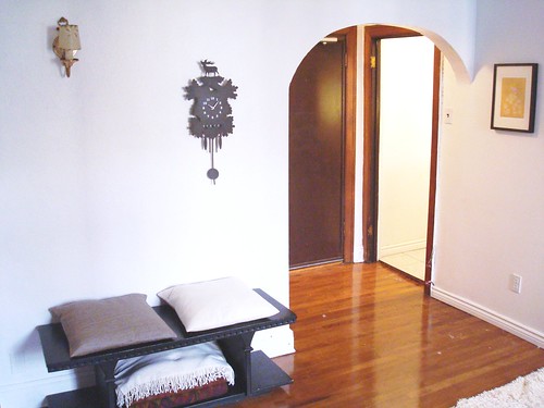
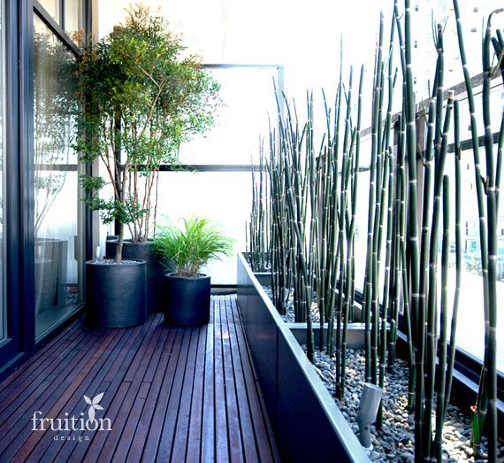
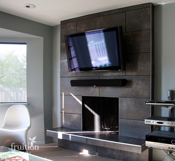
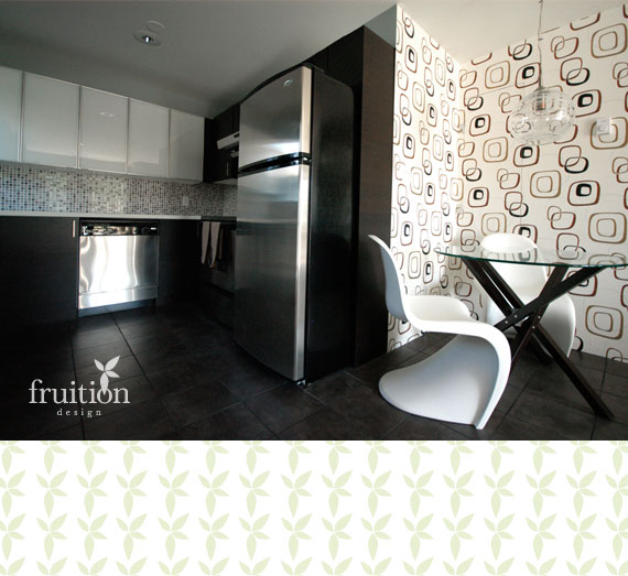
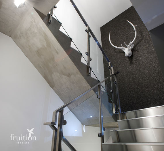
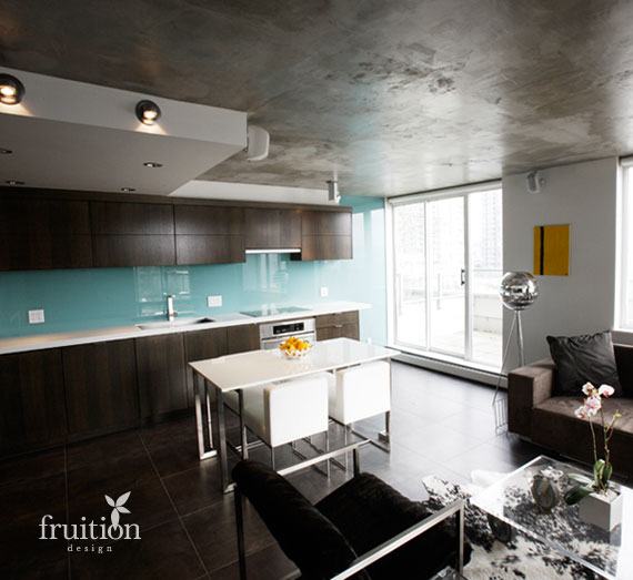
It's fun to brag on behalf of friends - almost as if by extension, you're bragging on behalf of yourself :P My friend Kelly Reynolds and his business partner Sharon Halpin started up fruition design last year in Vancouver and have three chic decorating projects completed and on display on their website already. Considering how new they are to the decorating and design market in Vancouver, they are doing fantastic! Vancouver, by the way, for those of you who've never been, is a drop-dead gorgeous city with every kind of living space imaginable (we're talking converted warehouses, 100+ year old heritage buildings, modern skyscrapers, beach bungalows...you get the idea), all against a backdrop of the pacific ocean and coastal mountains. It's a pretty inspiring place - this clash and integration of nature with hardware with multiculturalism - and is super dreamy for those wanting to get in on the design and art scene. (Can you tell I'm a proud Vancouverite? and currently displaced Vancouverite...).

Anyways, I wanted to showcase some of fruition design's interiors here because I'm so happy to see my friend doing what he loves and being successful at it. If you take a look at their website, you can see the 'before' and 'after' shots of their projects which make these interiors even more impressive.


Wednesday, July 25, 2007

noguchi lamp love

What more needs to be said?

Tuesday, July 24, 2007

living room brainstorming

My dining/ living room space decorating confusion consumes most of my mind when I ponder my apartment. The rest of the space is coming along well, with only minor adjustments needed to start seeing big improvements. But my dining/ living room is a toughie. Similar to the photo above, you enter the joined space from the side (right in the middle) and it's the first thing you see when you enter my apartment. Directly across from the entrance are three cathedral-esque, iron-paned windows (which I love). At one end of the room is a fireplace with built-in bookshelves on both sides of it. At the far end opposite the fireplace is a blank wall with a view over the half-wall into my kitchen. Are you visualizing this? Anyways, my struggle comes in part to the furniture pieces I already have (a lovely antique square table that used to be my grandmothers (although I kind of wish I had a round table instead - easier to work with), a yummy rich-brown leather tufted chesterfield, a rectangular ivory-coloured shag carpet that's not big enough to fill the space, a soft blue tufted chair on wooden legs and a few random side tables that currently hold my tv, blankets, computer and overflow kitchen dishes). There is definitely potential, but given my tight budget, I'm trying to do as much to improve the space as I can without spending a penny - okay, well, limited pennies. If a splurge is in order, I would purchase an identical shag rug and sew the two together to make a larger, more space-fitting rug and a much-needed coffee table (preferably of a modern rustic natural wood variety but I flip flop on coffee table preferances all the time). But really, I needn't worry about any of that because my limited budget has been put aside for an upcoming east coast roadtrip, so furniture reorientation and already-owned or future paintings by moi will have to suffice. For now. (I realize that my space might not sound that difficult to work with but the real tough bit is that it's challenging to create a 'living' space encircling the fireplace because the entrance to the room cuts right into the middle of potential said-space...okay, okay, I'll post photos soon to make better sense of this)...but all of that to say that I am gobbling up ideas wherever I can find them on dining/ living room layout ideas and am stoked with all the yummy visuals that domino magazine has to offer - my favorite of which you see here. And before I go, definitely worth noting is sfgirlbybay's super inspiring living room transformation.

alison spear

I came across Alison Spear's interior architecture site via desire to inspire's blog and really like her use of space and light and large-scale art. These are definite keepers for my e-mental scrapbook of ideas...


And I thought I'd throw in a couch she designed that I love. I can't really tell if it's plum or charcoal-coloured, but either way, a great, timeless, classy piece that would look fantastic composed as is against a solid or wallpapered wall, as well as surrounded by ornate lamps with a fluffy wool throw and a few graphic pillows on it. Hurray for versatality!
Related Posts with Thumbnails