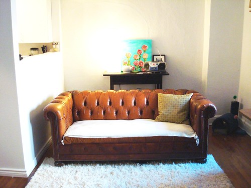
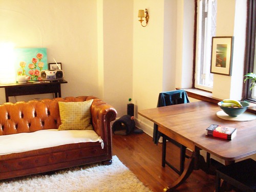
Views when you enter my apartment and first look (from left to right) into the living room.
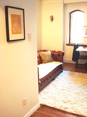
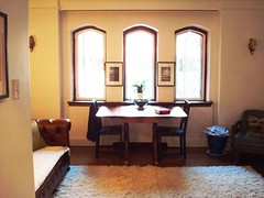
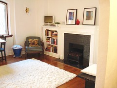
Looking (left to right) towards the back wall of the living room (with the space that looks into the kitchen).
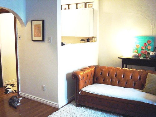
Looking (left to right) towards the fireplace (with the last shot looking towards my kitchen doorway and apartment door). PS - the black bench thing under the cuckoo clock was rescued from the basement dumpster - score! 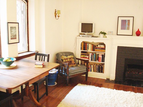
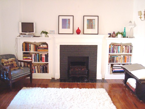
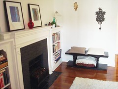
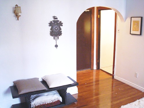


A few things to note: I bought a second matching rug this week (in the 'as is' section at ikea - discounted and therefore justified right?) to help the shag fill the space. I plan on sewing the two together so they don't separate every time my kittens attack them. I wish I could centre the rug in front of the fireplace, but the kitchen wall that juts into the living room prohibits that. Also, I've tried the dining table against the back wall and the couch closer to the fireplace, but it really makes the room feel small - plus, I like having something centered under the windows (used to be the couch). Okay, let the advice flow...thanks!
7 comments:
What a lovely space and such nice architectural detail (windows, fireplace, arched doorway!). I am envious!
I think it looks perfect as is, and yes, it is shorter than I imagined, so I agree with putting the table near the windows, so the living room part isn't so cramped.
I like the placement of everything but wish the chair could face the window on the other side of the fireplace. But then the window-side of the fireplace would be bare, and the symmetry is wrong. And you would need a place for your bench as well. That is a neat little piece!
Excellent job. I also love your colours - very calm and my favorites - the whites, ivories and wood colours! Love the new rug! I think you don't need our help....
I love your space - it's got great details as terri pointed out. I think your set up isn't bad...and the rugs look fabulous. They really warm up the space. The only problem I see is that the dining table, as cute as it looks under the window, kind of cuts up the seating area. I keep thinking about the table against the wall where the couch is and the couch under the window with a nice sort of big coffee table in front - something in lucite or glass. Then your chair sort of where the bench is but not so close to the wall and on the rug angled to face the couch. This makes more sense to me so you have a seating area, where now it's sort of scattered aroud the room. Maybe the bench could then go on the right side of the couch sideways as a side table. But not sure if the scale is right. Hope this all makes sense.
hmmm - i really like the clock but i think it would look much better in orange
M
Thanks guys! I appreciate the ideas. I actually moved everything around this weekend - similar to kim's ideas, but not quite...and I'm much happier with the newest arrangement. Photos coming soon!
M - interesting. Although I think an orange cuckoo would look much better against a dusty grey-blue wall...
Built in bookshelves, surrounding a fire place. With that as your starting point, you can't go wrong! The apartment looks stunning Joc and I can't wait to see more photos. Love this blog!
Thanks Annie! They're coming! I finally cleaned up and organized my bedroom last night so photos of the whole place will be read soon :)
I love your apartment. I really like the wood floors.
Post a Comment